
 It was a trend during the dark days of the web (read: before html5, when the world required Flash for animations on the web) that designers would create custom, wacky, non-standard navigation elements on their sites in an effort to look more “hip” or “cool.” When you went to any given website that employed this tactic, the first few minutes were spent hovering over icons to figure out what each of them did. This is, of course, after you waited for the website to “load.” This sort of horrible design got so bad that it became known as Flashturbation.
Thankfully, I haven’t seen much of Flashturbation since around the time MySpace died (correlation, not causation, I’m sure).
Still, it crops up from time to time.
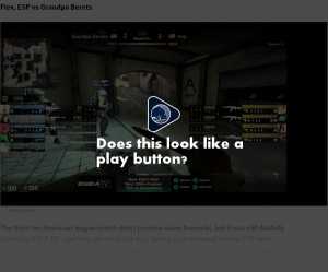
Why am I writing about this? I just wanted to call out Red Bull’s website and their decision to break the play button, which has been a dominant design standard since the 1960s. I got halfway down the page before my mouse accidentally hovered over the triangle icon and it was then I discovered that the images were actually videos that could be played.
It’s okay to style an icon. It’s not okay to break it.